web 2.0

Thursday, 26 November 2009

A Pretty Prototype and More Fieldwork

Ryan produced us a prototype, of which we now have somewhat blurry photographs!


We also decided some additional fieldwork is necessary to get a more complete feel for our stakeholders.

We will be attempting to chat with:

  • A nutritionist
  • Someone from Love Food Hate Waste/WRAP
  • Someone in the food industry, such as an area manager at Tesco
  • Parents of teenagers who will be leaving home relatively soon
  • Young people who have recently left home

We will also being doing several trial runs of each of the use-cases described previously. We're in the home stretch now!

Tuesday, 24 November 2009

Project Timeline, Prototyping Sketches, and Use Cases

Today we had a long chat about where our current product fits in with our research and the problem of food waste.

To do that, we made a project timeline charting what we had done throughout the course of the project. In particular we looked at the scope. In the bottom left hand corner of the timeline sheet, you can see the tracking of our project scope from the whole of food and sustainability to our smallest point at portion control, then back a little wider for the current design solution, which approaches food waste from the knowledge and education angles.


After we were satisfied with that, Ryan and Liza started making preliminary sketches of the design for our card prototype.


We also developed use cases. They are, from top to bottom:

Go to Tesco without any particular plan in mind, buy what you normally buy and put it all in the fridge. Then, choose a method card and ingredient cards to fill out the recipe.

Or, start with having only a few things in your fridge. Take the ingredient cards for those, and see what method card works for what you have.

Or, use the cards to decide what you want to cook to eat, make a list of ingredients, and then go to Tesco to buy it.


Monday, 23 November 2009

Ingredient Card Clarification

Today we really hammered out what was going to go on the ingredient cards, and how one would use them.

Each ingredient card will have a photograph of the ingredient, information on how to properly select the ingredient, how to store the ingredient properly, how to handle the ingredient safely, and the portion size. (Note how pared down this information is in comparison to what it was!) The cards also indicate what cooking method the ingredient is well suited for.

With the ingredient cards there are method cards. These are slightly different than ingredient cards, because recipe cards imply a specific set of ingredients. Method cards are more like a recipe template. So, for instance, if you have a Stir Fry method card, instead of calling for beef, carrots, and bell peppers, it would call for 1 serving of protein and 2 servings of vegetables. The method card describes how to combine the ingredients in a generic enough way that it works for basically any ingredients you choose. The method cards also have suggestions for good combinations of ingredients and encouragement to get creative.

We decided on a number of categories for method cards, each with at least two specific methods therein:

  • Pan dishes (Stir fry, pasta)
  • Soups (Stews, Broth-based, Creamy, and Pureed)
  • Baked stuff (Quiches, Casseroles)

Sunday, 15 November 2009

Recipe Cards

From the research I did online it appears that recipe cards are a way of jotting down your favourite recipes to either keep them or pass them onto a friend. They could be seen as a social tool. Online they seem to be mostly blank cards for you to fill in and pass on.

I did find a pack of cards online for Tagines which was a whle deck of cards dedicated to different Tagine recipes. Here is what one of the customer reviews said:

"The recipes are well-written and easy to follow and the results tasty. I thought cards would be easy to use and they are, but it's hard to find the recipe you want because the cards are not numbered - indexing or colour-coding the sections would make it easier. So I wouldn't particularly recommend recipe cards, I'd go for a conventional book next time."

This falls inline with the other recipe/cooking cards that I found being sold online. Most merely explain the recipes, ingredients and quantities. We need to integrate our cards into a cooking system that can adapt to what you have at your disposal.

I also found this kids recipe card deck selling on amazon: http://www.amazon.com/Kids-Kitchen-Cooking-Card-Deck/dp/1846861764

Although this is based at kids it divides foods into groups using colour coding and food groups. I feel that there are going to be similar things out there at the moment but we need to have a USP (Unique Selling Point) in order to ensure we are doing something brand new.

Thursday, 12 November 2009

Ingredient Card Prototype

Here is the first iteration of the ingredient card prototype!


For this we'll need to develop a consistent symbology. Right now, the little calendar is to show how long you can store it (though maybe a picture of a fridge would be better?), the shopping cart is how to select it in the store, the thermometer is to what temperature it has to be cooked to be safe to eat, and the frying pan denotes good cooking methods. On the back of the card, the magnifying glass gives good search terms to help people utilize the vast resources of the internet in their cooking. The colored symbols on the card would be used to find ingredients that go well with the ingredient on the card. So if I wanted to make something to eat with chicken, I would look for all the other cards with a pink heart on them, and know that those things go well with chicken.

Monday, 9 November 2009

Prototyping Difficulties and Some New Direction


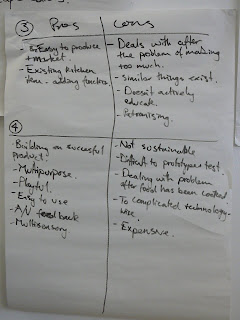
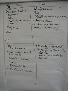
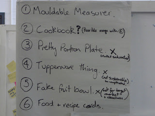
Only one of us managed to get a prototype completed in the week we had to prototype. Ryan finished his delightful and fun moldable measuring device. Unfortunately, I managed to explode that prototype before our morning meeting was over. It was at this point that we decided that physical prototypes of so many different items was a bit of an unrealistic goal given our financial and time constraints. So we set about trying to narrow down our prototypes to the ones we really wanted to pursue by listing the various pros and cons of each idea. Before we did this, Fraser (our module leader) dropped by to have a chat with us. While talking to him, the old idea of the food education ingredient card deck resurfaced. He really liked the idea and encouraged us to pursue that as well. So it ended up on the list as well! So much for narrowing things down.

Fortunately, our Pro/Con exercise took care of that for us.
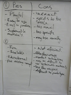


In the end, we decided that the fruit bowl was likely not going to be appropriate for our target audience of young people (after all, how many 20-somethings do you know who keep a bowl of fake fruit in their kitchen?). The pretty portion plate had a number of strikes against it--it doesn't address the problem of making too much food, just of not eating too much food. Additionally, there are a lot of portion control plates available on the internet; perhaps none as lovely as we intended, but if people aren't buying the ones available, it's unlikely that our product would be any different. The moldable measure is cool, and fun to play with, but we thought the novelty would wear off pretty quickly. A measuring device doesn't do any good if it's never used.
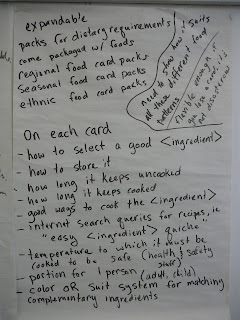


We concluded that we were most interested in pursuing the deck of ingredient cards in tandem with the recipe book--putting together a kitchen knowledge kit for young people. We haven't completely ruled out the other ideas--in fact, we're making little advertisements to show to people to get feedback on them--but we're also prototyping the ingredient card deck. Here's a picture of our brainstorm as to what should go on the cards!

Monday, 2 November 2009

Solution Brainstorm

Today, we met to brainstorm solutions to the problem of making portion control fun. We began by getting everything we could think of up on paper. Our brainstorming session is recorded by the picture at right. No idea was to wacky! We were aiming for quantity, not quality.


Then, we organized those ideas into sets of similar ideas.


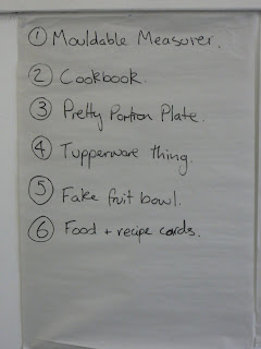
We then voted on our favorite ideas, narrowing it down to these five

  • an interactive toy measuring system, like something you build to make more measurements (inspired by LEGO and Transformers)
  • a measuring system that molds around things, such as your hand. Then when you hear, "A serving of rice is the size of your fist", you can actually make a hole the size of your fist to measure your rice
  • a Tupperware system with built in scales that gives audio/visual feedback based on how long the food has been in the fridge. (ie, it makes a happy noise when the food is fresh, and less happy noises as it slowly approaches bad)
  • a recipe book with pop-out measuring puzzles. For each recipe, there is a page with the necessary measurements for that recipe, which (like the collapsible measuring cups) can be popped out into a three dimensional form to measure the ingredients for the recipe.
  • measuring cups designed to look like fake fruit--useful as well as ornamental!
  • a portion control plate where the appropriate portion markings are built into the design of the plate, making it less obvious and more beautiful
We each took one of these items to prototype, so that we could take the prototypes to people and get feedback to iterate our design.